Picabash
Usability Evaluation

CHALLENGE
Picabash wanted to evaluate their site’s usability for both vendors and individuals in the local community. First as a team, we set out to research and test the usability of the site to address areas of opportunities and success. Additionally, after the group research was concluded I was asked to individually assess the findings from these usability tests in order to create and provide a findings and recommendations report to Picabash.
SOLUTION
I provided Picabash with a Findings and Recommendation Report. Included are high-fidelity wireframe solution in this report, with a main focus on problem areas identified in research with usability testing, along with my recommended solutions for the identified problem areas.. This report also aims to provide a general timeline to Picabash so they can execute the recommended solutions which are organized in a prioritized order.
Methodology
• Heuristic Analysis
• Moderated In-Lab Test Session
• Moderated Remote Test Session
• Think-Aloud Protocol
• Usability Testing
Tools
• Sketch
• Trello
• Keynote
• Axure
Client Deliverables
• Findings & Recommendation Report (PDF)
• Protocol Evaluation Script
• Notetakers Guide

Picabash
Picabash serves as an event planning resource website aiming to connect people with the best vendors for their event, venue and event service needs.
Additionally, the site strives to promote and emphasize women and professionals-of-color owned small businesses in the local community.


User
Primary User
Event vendors looking to identify new and/or support existing clientele
Corporate event managers with dedicated budgets to hire specific vendors
Individuals looking to plan an event at a specific location or with specific products/services
Secondary User
Individuals without an upcoming event need who are interested in perusing vendors
Research and Context
Assessing the current site functionality, various features and general usability
In order to understand the focus areas on improvements on Picabash’s website I first conducted a Heuristic Analysis on the main user tasks. There were clear violations on a few key areas which framed our research goals. On both a customer side and vendor side, I proceeded to complete main user tasks which had a large number of issues. These were centered around the search and booking process unclear navigation and mismatched mental model expectations, the desirability of vendor use and benefit to them of account set up, as well as the problem of no clear diversity presence that the site aims to provide.
Research Goals:
Determine extent to which customers understand the browsing/search/booking process. What obstacles are customers finding?
Analyze the desirability of use an account profile to vendors - how does the application offer features that incentivize them?
Evaluate extent to which the value of promoting women and POC owned businesses are perceived by consumers on site
Usability Testing
Evaluating user interactions and navigation of the site with usability testing
Once the heuristic analysis was complete and our team identified the research goals that we would be addressing, together we created and designed usability test evaluation plans with scenarios and tasks for participants.
We conducted remote and in lab moderated usability testing with a Think-Aloud Protocol used for each participant. We were able to complete the testing at Fathom Consulting and each moderated a session and took notes from the observation room.
Usability test focus areas:
Ease of search process and navigation of site
Vendor incentives to use site and benefits
Vendor and community connection evaluation
Presence and visibility of diverse business owners
Findings and Insights
Synthesizing and organizing the test session findings and data
Our group analyzed and evaluated the results from the testing sessions. We broke off into creating findings and recommendation reports after synthesizing the data and understanding where we could focus on providing recommendations to Picabash.
To best prioritize the current issues on the site, I provided a severity rank scale that shows the violation level of the features assessed in the usability testing sessions with participants. Providing this allowed me to prioritize the revisions recommended to Picabash, for the most efficient use of their resources as well as optimized ROI from the features.
Outlined below you will see each area that was assessed from the usability test sessions. Outlined in each area are the findings from each specific focus in testing and rating of the severity on each issue.
These findings helped to provide the recommendation and changes that were provided to Picabash in the deliverable report.
The solutions with recommendations and provided wireframes are shown after the following finding overviews below, included in the annotated wireframes section.

Ease of search process and navigation of site
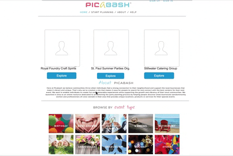
Participants noted the main search page was “confusing”, “unclear”, and felt like the site gave too many options and starting points with unclear signals on where to start their search.
When creating an event there is a required field to put a name for your event in the search process. Users expressed frustration with limitations of this requirement of an event name slowing down their process. Many participants felt when they reached the search results it was “empty” and “felt like a new website since hardly any vendors showed up”.
This resulted in clear mistrust from users on the credibility and value of the site. Users weren’t given clear search results, lacked understanding on the difference of ‘Premium’, ‘Featured’, and ‘Other’ vendors separated on the page, or had to type and specify too many options in search field criteria on the results page to feel it was useful for them or helpful in their search process.
"I'm not clear on where I should begin searching because I see the dropdown choices and the event type choices”
-Remote test session participant
Vendor incentives and benefits to using the site
Vendor’s account portal page when logged in lacks clear navigation and way-finding for vendors. There is no navigation bar at the top of the business profile landing page when vendors are logged in. Combined with the navigation, there is no feedback provided from the site after clicking “Save & Continue” on the bottom of the page as user completes filling out profile information fields and sections.
Participants noted they thought there was an error or they thought nothing happened at all without confirmation feedback or natural transition/movement to a “home” profile page.
Participants struggled to find business analytics or useful features of an account without intervention from the moderator on how to get to the business dashboard from the small, hidden drop down menu under clickable’s vendor name. Most beneficial page to vendors was hidden and buried, resulting in no motivation for vendors to utilize the site.
"That should be what clicking on ‘home’ takes me to-the business dashboard page when I’m on my vendor account profile."
-Remote test session participant

Vendor and community connection evaluation
Throughout the test sessions we observed critical issues around customers trying to connect and interact with vendors on the vendor public profile pages. When participants were prompted to try to book a vendor in testing and show their attempts on how they would complete this, almost all expressed the complexity and lack of clarity regarding the process.
Vendor or business images placed at the top of the vendors profile created uncertainty to participants on what the page intent was, and nothing indicated how to connect with the vendor until users reached almost to the bottom of the page. Picabash aims to improve users ease of booking and contacting vendors, yet the public profile page of vendors lacks evidence through the hierarchy of vendor’s pages. All participants disclosed they would use the vendor’s website to contact them, taking users away from the site, essentially defeating the intent and purpose of Picabash.
"I want a book now button, it should be that easy.”
-In lab test session participant
Presence and visibility of diverse business owners
Additionally there was a major gap around visibility of women and professionals-of-color owned businesses. This was evident to every participant that conducted testing sessions.
Before scenarios were presented around this subject, there were four comments specifically noting the lack of diversity on the site.
After informing participants on the site’s mission to provide emphasis and focus on women and professionals-of-color owned business, many were excited and expressed emphatically they would use the site much more often.
Users would be drawn to use Picabash if a focus on diversity was obvious from the site’s images and content. Overwhelmingly, the lack of diversity was the most evident finding noted from the participants.
"Most images I'm seeing are not of people of color. I'm not seeing anything indicating to me that they support that [women and professionals-of-color owned businesses]."
-In-Lab Test Participant
Likert scale questionnaire results from test sessions

Findings and Recommendations Report
From the group research findings and synthesizing them as a team, I proceeded to individually create and build four high fidelity annotated wireframe solutions. These solutions were based on the four focus areas of our group research session and each highlight the features that I proposed, aimed to solve the findings from our user findings on the test sessions and feedback.
Major potential for Picabash exists and our team received feedback from a large number of participants expressing interest and draw to using the site if there were revisions made. My findings and recommendation report for our client focused on a number of solutions which did not require large amounts of financial resources or manpower.
View full PDF report here:
Annotated Wireframes


Prototype Walkthrough
Recommendation for a ‘book now’ button for vendor profiles
Utilizing recommended solutions I provided in my report to Picabash, I built an interactive prototype demonstrating the functionality. In order to best connect the community with vendors, I strongly advise creating a “book now” button on vendors public profiles.
This prototype walkthrough shows how a user would navigate and use this “book now” button on vendor public profiles. Additionally it shows a path that users could take to get to the vendor public profile, starting their process on a revised search page solution I provided to Picabash.
The book now button should be visible and prioritized at the top of the vendor’s profile page. Providing a focal spot where users understand how to begin contacting vendors is key for the community to contact vendors and utilize services.
Not only is this important for the community, the “book now” button would keep Picabash users inside the site, instead of navigating away from Picabash in order to get to the website of the business right away. This would increase Picabash’s business and traffic on the site by providing users a way to utilize a key function and purpose of the site.